
Building a Stronger Identity for Indy’s Arts Community
A Name That Says It All

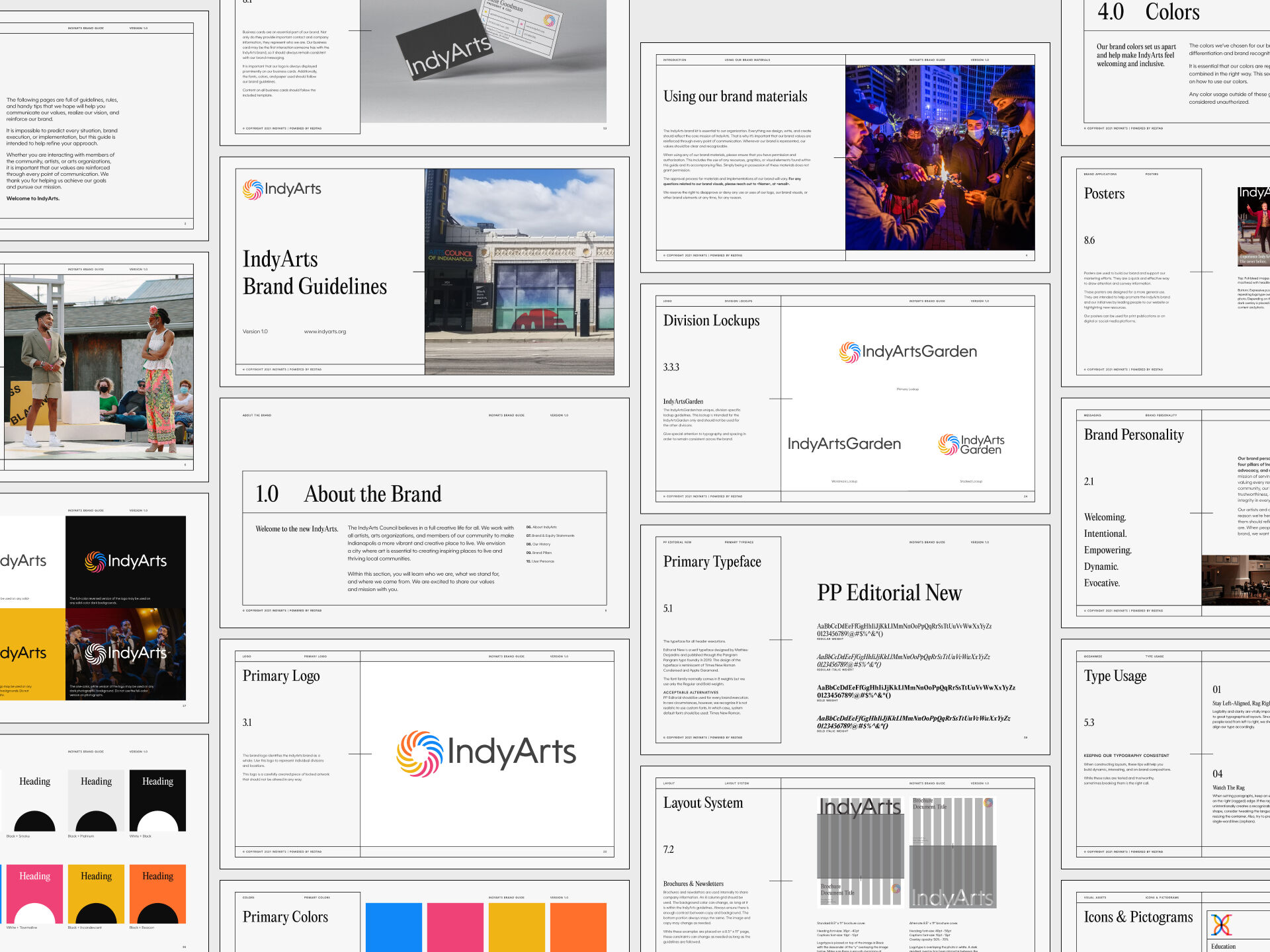
We began with one simple but transformative move: renaming the organization “IndyArts.” The new name distills the essence of their mission into something memorable, modern, and unmistakably local. It became the foundation for a brand identity that’s both accessible and aspirational, rooted in the city’s creative pulse and ready to speak across channels and audiences.

Brand Values Expressed in Color
Drawing inspiration from the organization’s four core pillars—Education, Equity, Creativity, and Advocacy—we built a color-driven system to represent those values in every branded application. Cerulean blue stands for trust and learning, while tourmaline pink champions equity and compassion. Radiant yellow celebrates creative energy, and bold orange ignites action and advocacy. These hues work in concert to create an expressive visual rhythm.

Harmony at Every Touchpoint
From a refreshed logo to a cohesive tone of voice, every piece of the new brand was designed to resonate. Whether used on a grant application or a city mural, the rebrand became a platform for connection and impact. IndyArts now shows up with clarity and a unified purpose: to amplify the voices of Indy’s thriving arts scene and inspire the next generation of creative leaders.


.jpg)
